Pages

Tuesday, July 28, 2015

10 Reasons Why Artsonia Benefits Parents!


Two years ago, I posted 10 reasons why Artsonia.com improved my classroom, which you can view here.  I started using Artsonia a few years back to help improve my classroom, curriculum, and parent communication.  I was so amazed with the results and feedback received, I don't know how I would run my program with out it!

Last year, my daughter entered 1st grade and received her own Artsonia account.  Fro a parent perspective, I loved everything about the website.  I looked forward to receiving emails with new artwork posted, plus I could share my daughter's work with family and friends!

I wanted to share 10 reasons why Artsonia benefits parents as well.  If your school does not have Artsonia's online art gallery set up, I highly recommend sharing this with your school's administration and arts program.  You will love what Artsonia can do for you as a parent!


1. You see your child's art before it comes home.  Many students (especially older children) to not bring their artwork home.   I like to think that Artsonia helps hold them accountable for their progress since parents can now see their work instantly.  Many times I have also heard that parents never see their child's artwork because the art teachers never give it back.  From the teacher perspective, many times we have to display work and show our student's accomplishments within the school with displays and shows, so it may take some time to send artwork home.  With Artsonia, the moment the teacher uploads the artwork, parents receive an email with a digital image of the art!

2. Some projects get tossed over the years, but you keep a digital image for life.  As your child grows, the artwork you keep may fade or ruin over time.  Artsonia keeps all the digital images archived for you, plus you can copy and save in your own documents.  This way in case an artwork gets torn or tossed, you still have a digital copy for yourself saved!  EXTRA BONUS!  Did you know you can upload artwork into Artsonia from the parent's account?  If your child makes art at home, snap a photo and upload it for family to see!

3. You keep your account for-ev-er! If your child starts with an account at an early age (ex. kindergarten), that account will last through high school and still be accessible for you even after.  Even if you transfer schools, as long as the next school has Artsonia set up, all you need to do is send an email to Artsonia and they will move the account to your child's next school.  If you're in a district with K-8 with multiple schools, you can easily have all the elementary moved to intermediate, then to jr. high!  This way, you don't need to restart a new account and lose all the archived images of your child's artwork.

4. Your child's identity is protected.  In Artsonia, no last names are ever used publicly, so your child's identity is always protected.  You, as the parent, also have control over your child's account.  The art teacher uploads the artwork, then you can share it with whoever you wish.  Also, if anyone comments on your child's artwork, you approve the comments before they're shown publicly.

5. You can share your child's work with family and friends.  As I mentioned above, you have control over your child's account, which means you can also share the artwork with family and friends!  Every family member you add on is called a "fan club" member.  When you add them to the account, they also receive an email with your child's art.  If family lives out of state, this is a way to say, "Hey, look what my kid made!" and grandma, auntie, or cousins can share their pride as well.  When I shared Artsonia with our district board members, attendees shared positive comments about this feature and were thankful to have a way to share their child's progress with family.

6. Easier communication with the art teacher.  In many cases, the art teacher is so busy taking care of multiple grade levels, activities, shows, etc., they are unable to contact parents regarding their child's progress.  Through Artsonia, the art teacher can send their own newsletters, and emails your way to update on any progress.  On your end, you can also comment on your child's artwork, which helps with communication flow, and you can boast about your child's amazing art skills!   Also, the art teacher also adds the project description to the exhibits, which helps explain projects and standards to the viewers!

7. Emails are not annoying spam in your folder.  Yes, you will be receiving emails, but it's not as bad as  many other stores or companies that send daily spammy emails.  When you receive an email, it's either because a) your child's artwork has just been posted, b) a family member just made a comment for your approval, or c) there's a holiday sale in their shop.  The art teacher's newsletter also comes through as an email, so it's less paperwork your child's bringing home.

8. Your child's artwork receives comments!  As a teacher, I like to share comments and galleries with my students.  They love to see not only their artwork posted, but the comments that family and friends make about their work.  The smiles on students' faces are precious and gives them a boost of confidence in their artistic abilities!  As a parent, I also share comments made by family members with our daughter.  She loves to see what's written by her nanas and fan club members.  Kids love feedback from all ends!

9. Instant holiday gifts! As a teacher and a parent, I understand the need for fundraisers. They are hard work, and can be challenging to organize.  Artsonia is an instant fundraiser that's extremely easy to use.  Did you like to recent painting your child made in class?  You can instantly buy a magnet or a t-shirt of it through Artsonia.  You can do this any time of year (even during the summer), and artwork is always available for you to choose (remember, archived forever!).  20% of your money spent goes directly back to the school, which is always a bonus!  Many art teachers who use Artsonia use funds for materials in the classroom and updating resources for the students, so your contributions always help!

10. You're supporting the art program at your child's school.  The arts are a valuable part of your child's development.  Art helps bridge the gaps between all core subject matters, plus helps your child build imagination, craftsmanship, and creative thinking skills, which are all needed in your child's development!  Artsonia is also a huge benefit for the art teacher.  The online art gallery is a great way for the teacher to assess and provide evidence of student progress.  Other reasons are posted in my previous post, 10 reasons Artsonia Improved my Classroom.

If your school does not have Artsonia, consider contacting your school's art teacher and discussing the possibility in starting an account for your school.  This website is a HUGE benefit for you, your school, and your art teacher all around!

Tuesday, July 7, 2015

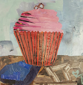
Summer Workshop Series: Wayne Thiebaud-Inspired Cupcake Collages

This week I entered new territory in my teaching career.  For the first time since student teaching, I worked with high school age students, and it was a wonderful experience!  

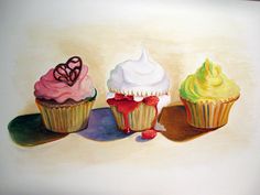
The project we created was a "cupcake collage."  To take a quick step back, when the studio owner and I sat to plan our summer projects, she had the idea to create cupcakes with magazine paper.  I immediately thought of Wayne Thiebaud's dessert creations and thought it was a good tie-in with artist-inspiration!

Wayne Thiebaud is currently 95 years old!  Here's a few pictures of him and his artworks:


Materials
-16" x 16" illustration board
-A ton of magazine pages (it's best to separate the pages, and if you have time, the colors)
-Mod podge
-Brushes
-Pencils
-Scissors
-To water down the mod podge, add a hint of water to about a 1/4 cup of mod podge.  It helps the glue spread and soak into the magazine paper.

Objectives
This project was designed for ages 14-16.  Students will create their own cupcake collage using magazine paper.  They will demonstrate value by showing highlights and shadows within their artwork.

Directions
The project was completed in a 2 day summer workshop (2 hours each class) through Pastiche Studio.

On day 1, we began by looking at images of Wayne Thiebaud's paintings and identifying how the artist created highlights and shadows within his dessert designs.  We especially looked at the cupcake designs to see how Wayne had emphasized his colors to create the values.  I also shared my finished example with the students and explained how the magazine photos can help in creating the highlights and shadows needed for their artworks.


Each students was given an illustration board as their canvas.  We went over how to draw the cupcake wrapper and icing step by step and sized our drawings within the board.  I especially loved how each students chose a decoration for the tops of their cupcakes!  When they were ready to start gluing down the pieces, I explained how we needs to start with the background first and add the layers on top.  I explained to first brush the glue onto the illustration board, place the paper on top of the glue, then spread another layer of mod podge on the paper to flatten down.  Sometimes the magazine paper curls up and needs to be flattened!

Since this was my first time teaching this age group in a few years, I under-estimated the amount of time it would take to complete the background.  I was observing the students and how they paced their time gluing around the cupcake and finding the exact colors needed for the table and the back color.  During the second hour on the first day, I was tearing out pages with colors the students needed to save them time on searching for colors.  So, if you decide to create this project with your students, a huge time saver is having the magazine pages ready in advance!  Sometimes we learn the hard way!


This was the stage we were at after the first day of class.  Table completed, background not as much, but we pushed harder on day 2!


On day 2, the students completed the background within 20 minutes (after I pulled out the colors needed from the magazines).  We then started on the cupcake!

I demonstrated to the girls how to find a magazine image they liked for their wrapper.  They placed the magazine paper on top of their cupcake wrappers and sketched an estimate of size around the space they needed.  I mentioned to the students to trim out the shape larger than they needed in case they traced too small.  Next they glued the entire shape down, as seen below:


For the next step, they found another image that would represent the highlight or shadow of the cupcake.  The students were asked to cut the image into strips with points, then glued down spaced apart.


Now time for the icing!  The students were asked to find a highlight, medium, and shadow of the same color hue.  In most cases, white worked as the highlight.  We trimmed out and glued down the shadow first along the bottom of each icing layer.  Next, the students used the "estimation" trick I shared with the wrapper to cut out the icing medium color for the entire layer.  Once the oval shapes were cup out, they were able to trim down to fit their space.  Lastly, they drew and cut out a skim my teardrop shaw for the highlights of the icing.


For the last step, students filled in their cupcake topping decorations and viola!  Finished cupcake collages!  And they all finished right on time!  I was SO proud of them!!!!


I can't wait to do it again!  If you collect Art News magazines, they have tons of artworks and painting that can be used as textures in your collages!

I went through Pinterest and found that this process has been done before, and I'd love to share what pins I have found.  I would love to try a similar project with the younger grade levels I teach.  I also found a contemporary artist from Texas named Nancy Standlee, who creates cupcake collages too!

Thursday, July 2, 2015

Summer Workshop Series: Winslow Homer-Inspired Pirate Ships


Winslow Homer (1836-1910) was an American painter known for his seascape paintings.  When looking through his artworks, we see cloudy, windy skies, waves in motion, and dulled colors.  When we browsed through project examples, I came across a project from Deep Space Sparkle that inspired the summer workshop project for this lesson.


Materials
-14" x 16" 70# white paper
-10" x 16" white poster board
-Blue, black, and white tempura paint
-Brushes
-Water
-Water containers
-Your fingers
-Colored construction paper
-Scissors
-Glue
-Pencils
-String
-Images of ships for reference

Objectives
The students will create their own mixed media sea scape using paint and assemblage of paper.  They will create foreground, middle ground, and background in their seascapes.  This project was created for students ages 6-9.

Directions
This project was completed during one studio class in a 2 hour length of time.  We started with creating a paint wash sky on the 14" x 16" paper.  We used blue for the sky, then painted in white and black strokes to blend in for cloudiness.  Once the paper was finished, we put it aside to dry.

Next, the students created wavy texture on the poster board using their brushes, then their fingers! These two steps took about a 1/2 hour to complete.


Once the poster board was painted, we put it aside to dry.

We then created our pirate ships/sailboats using colored construction paper.  Here are a few examples I found on Google and shared with my students for ideas in creating their ships:


Construction of the ship took around 45-50 minutes to complete.  Once the main body of the ship was completed, the students took their "mostly dry" sheet of poster board and cut four strip apart.  Each strip was sit to resemble waves in the water.  We then glue down each layer, placing the boat in between the wavy layers.


Once the layers were glued down, students created the mast, sails, and glued down the roped using string or yarn!

Here was the example I made to share with the students:


And here are my students' amazing creations!


Wednesday, July 1, 2015

Summer Workshop Series: Gyotaku Fish Prints


Today I had the opportunity to teach one of my favorite projects, gyotaku fish prints!  Since I had a three hour class and only one student, I introduced three different projects during the two hour class.

Gyotaku (gyo=fish, taku=rubbing) is a traditional Japanese method of printing fish.  This practice dates back to the mid-1800's, when fishermen wanted a way to document the fish they caught at sea.


(images found on Google)

Gyotaku Fish Bowls

We started off with the first project, which is a simple gyotaku print fishbowl.  The directions for creating this project can be found here.


For the other two projects created, we used these silicon rubber fish purchased from Nasco, Triarco, Dick Blick, or any art supply catalog that carries gyotaku supplies…minus the real fish!

Traditional Gyotaku Prints

For this project, we used black tempura paint, one sheet of 10.5" x 16" rice or handmade paper, and the student chose one rubber fish to paint on.  The objective of this mini project was to practice adding the paint to the fish to create the print.  Too much paint will not copy the details of the fish (fins, scales, etc.), and too little paint will only pick up brush strokes and empty spaces.  The student practiced adding the paint to the fish and pressing the paper down to print the fish.

I found a perfect video which explains the process here.  The video (from Sakura) also introduces another project that can be made with the fish molds!


Here is the final product we made from the traditional print!


For the last project, we stuck with the same process as above, but designed a more detailed background using crayons and heavy weight beige paper. Like the fish bowls, the student designed an underwater picture, but added more attention to details with highlights and shadows in the seaweed, shells, rocks, and coral.  Once the background was colored with the crayon, the student chose three colors to paint her rubber fish for printing.


After the student pressed the paper to the fish for the print, she then went back in to fill in additional details, such as the eye and areas the paint did not print over.


Here's her finished product!


One happy student leaving the class with three different projects!